I also want to talk about people who tell you what they do, them demonstrate traits that don't support that statement and indicate they're probably not very good at it anyway <== this has absolutely nothing to do with either of the speakers I just mentioned. <<= not going to talk about this because this is me just being bitchy and petty - in future, if your mouth and your traits don't align, I'm gone-burgers. Don't say you haven't been warned.
PLUS: HOW WOULD YOU FEEL? if the kid you used to babysit sat down at the same table at Webstock? I may not be the oldest person at Webstock, but contextually I just may well be. arg! GET OFF MY LAWN!!
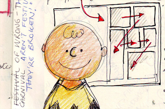
Visual Communication: Scott McCloud
"If someone says 'that's a terrible elephant' then you've succeeded."
The message from the workshops continue - communication. It's a two-way street with each artist needing an audience - the dialogue between the page and the eye. Scott McCloud is about transferring information fast or, at least, as quickly as possible. He wants to minimise the 'load time' between seeing something and understanding something.
He talks of timing and beats, of boxes and sequencing, of pacing and the things between. "As you move through space you are moving through time." Urging all to tell stories with pictures, optimising and simplifying. To resolve contours and watch out for non-articulated silhouettes.
Getting down to business
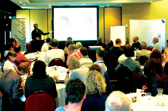
The workshop room was full again - 32 healthy heads. Scott McCloud has a good voice - he's easy to listen to and he says interesting things. He has scratched the surface of this thing and has picked the eyes right out of it.
He started with a history lesson of visual communication before breaking down the differences between cartoons and comics. Cartoons, he says, are a type of simplified image; while comics are images in deliberate sequence.
Our first exercise was about cognitive load; that is, how long does it take our brain to figure out the context of what we're looking at, then the content. With our large black makers and sheets of paper, we each had to draw four objects from a defined group: fruit and vegetables, vehicles, furniture, mammals (I can't remember the rest). Dividing the paper into four, we needed to draw as simply as possible, four objects from that category. Scott then held each of our efforts aloft, and we had to raise our left hand when we knew the category the four images belonged to, and our right hand when we recognised all four objects. The idea being that success equalled both hands raised at the same time - minimal cognitive load time.
It was interesting that those beats it took to recognise those two parts of the problem could grow when outlines were complicated, or too many details existed in the image. It was also interesting to see who could, or who did not, follow the instructions. Not that you have to do everything 'the man' says, but it was interesting that one person did four objects from a category that wasn't on the list. It was also interesting that someone else groupled a snowman in the 'mammal' category.
People are interesting creatures.
What'd you learn?
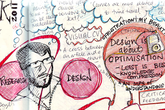
Optimise (there it is again), clarify, tell stories (theme becoming stronger), compel to propel (mo-mentum) - there is as much to be said between the words; between the pictures; between the boxes of a sequence of images.
Don't crash your viewer's brain. Don't require them to install plug-ins to understand what you're on about. Don't cause that spinning beach-ball in their head. Deliver them visual caffeine. Stimulate, minimise the time to understand - communicate concepts with clarity.
Great morning.. Webstock workshops: three for three :)
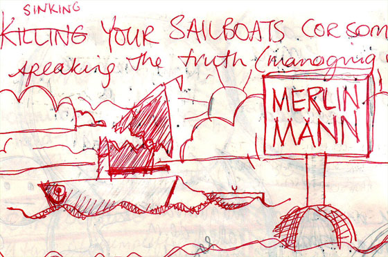
Sinking your sailboats: Merlin Mann
"I'm not trying to derail your derailment."
Merlin Mann. You either know who I'm talking about or you don't. This last workshop session before Webstock-proper commenced was highly anticipated. I just wanted to see this guy in action. And what a joy. Such a human, such a rabbit-warren of a mind, such a thoroughly likeable soul.
Merlin talks. God only know how his brain is wired to get that many words out of his cake-hole - the hamster-wheel in his brain must be supersonic to keep those ideas gattling-gunning their way out - and it all make sense - the tangents are offramps to more ideas, more stories, more, more more.
Dude, I was a fan before - now I'm boarding on cult-member. Such joy. Such a jolt-inducing batch of truths that one in particular would have brought me to my knees had I been standing.
Getting down to business
Merlin sat with us. He didn't podiumise, he didn't powerpoint. He system carded (oh I love a good system carding) and he talked. He also listened - he really did. Like us, he wasn't really sure what he was going to talk about (or did he?) and the session turned into a bit of a self-help group for people who are managed poorly. Thank God because I really needed a reality check and that's exactly what I got.
Again the session had a couple of other speakers as attendees. Marco Arment and Mark Pilgrim sat in and shared their stories, their ideas, their laughter. It was also great to hear from the woman behind the Inland Revenue website (ird.co.nz) and how that came to be. It's an impressive website and it wasn't born of project plans and budgets, but of passion and the inability of a person to take "no" for an answer. LOVED THAT!
The question that Merlin asked was this: what if everyone in your team was smarter than you? what if they all cared more than you do?
and I was okay with that until he asked: what if your boss was smarter than you and cared more for the company than you did?
Fox said my face showed the shock as Merlin's question sunk into my brain - but he was right, even if I've still not been able to process the question at a personal level for a specific person. "We're all extras in everyone elses movies."
What'd you learn?
Every man really does have his own reason. Merlin's session reminded me we all have the same problem with someone - and we really need to get over ourselves, think clearly, get real and get on with it. As Jeff Veen said, when he had a lot of trouble finding a seat at the table, he decided to build his own table.
This session, as with all the workshops and the conference to come, went a very long way to healing a big chunk of my soul. Thank you Mr Mann.


 It's strange to think how much of the stuff there is out there that I just take for granted. Words, man, they're everywhere - the way they look is because of the typefaces that have been created to display them. Yet it's more than display - it's another level of communication. I mean: we know that right? yeh, we just forget - or at least I did.

